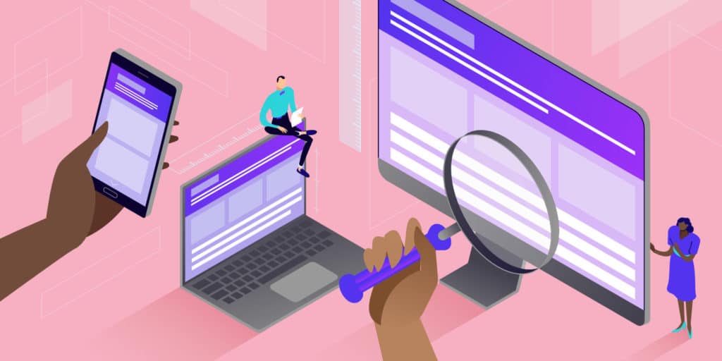
Responsive design is an approach to web design that focuses on creating a website or application that is user-friendly and visually appealing across a wide range of devices, including desktop computers, laptops, tablets, and smartphones. The goal of responsive design is to provide a seamless user experience, regardless of the device being used to access the website or application
Responsive design typically involves using flexible layouts, scalable images, and CSS media queries to adjust the layout and content of a website or application based on the size and orientation of the user’s device. This allows the website or application to adapt to the screen size, resolution, and capabilities of the device, ensuring that the content is easy to read and interact with.
The benefits of responsive design include increased user engagement, improved search engine rankings, and reduced development costs. By creating a single website or application that can adapt to multiple devices, businesses and organizations can save time and resources while ensuring that their content is accessible to the widest possible audience.
Here’s an example of a responsive design for a website:
Let’s say you have a website that features a three-column layout with a navigation menu on the left, a main content area in the center, and a sidebar on the right. When viewed on a desktop computer, the website looks great and everything fits nicely on the screen.
However, when the website is viewed on a smartphone, the three-column layout is too wide to fit on the screen, and the text and images are too small to read and interact with comfortably.
To address this issue, the website can be designed responsively so that it adapts to the screen size of the device being used to view it. Here’s how that might look:
On a desktop computer or tablet, the website would display the full three-column layout with the navigation menu, main content area, and sidebar.
On a smaller device like a smartphone, the website would use a two-column layout with the navigation menu and main content area stacked on top of each other. The sidebar would be hidden or moved to the bottom of the page.
The font size and images would also be adjusted to be larger and more legible on smaller screens.
By using responsive design techniques, the website can provide an optimal user experience regardless of the device being used to access it. Users can easily navigate the site, read the content, and interact with any features or forms, no matter if they are using a desktop computer, a smartphone, or a tablet.
Why is media queries important for responsive
Media queries are an essential part of creating responsive web designs. They allow developers to write CSS code that targets specific devices or screen sizes, so that the layout and content of a website can adapt and respond to different screen sizes and device types.
Without media queries, websites would only be optimized for a single screen size, typically a desktop or laptop computer. This would result in a poor user experience for visitors accessing the site from smartphones, tablets, or other devices with different screen sizes.
By using media queries, developers can create a single website that can adjust and respond to different screen sizes and device types. This can provide a seamless user experience and ensure that visitors can easily access and interact with the content on the site, regardless of the device they are using.
Media queries can be used to adjust a wide range of website elements, including font sizes, images, layout, and even the content itself. They allow developers to create custom designs and optimize the user experience for different screen sizes and device types, resulting in a more engaging and effective website.
Media queries are an essential tool for creating responsive designs because they allow developers to apply different styles to a webpage based on the characteristics of the device or screen being used to view it.
Responsive design is all about creating a website that adapts to different screen sizes and devices. Media queries enable developers to write CSS code that targets specific screen sizes and resolutions, and to apply different styles accordingly. For example, a developer could use media queries to change the font size, adjust the layout, or hide certain elements of a webpage on smaller screens.
Without media queries, it would be very difficult to create a responsive design that works well on a variety of devices. A website optimized for desktop screens, for example, would be difficult to use on a smartphone or tablet, where the screen size is much smaller. By using media queries, developers can ensure that their website is optimized for a wide range of devices and screen sizes, providing a better user experience for all visitors.
In summary, media queries are important for responsive design because they enable developers to create websites that are optimized for different screen sizes and devices, resulting in a more seamless and user-friendly experience for all visitors.
How can I use Media queries
You can use media queries in CSS to apply different styles to a webpage based on the characteristics of the device or screen that is being used to view it. Here’s an example of how to use media queries:
Let’s say you want to change the background color of a webpage based on the screen size. You could write the following CSS code:
body {
background-color: #fff; /* Default background color */
}
@media (max-width: 600px) {
body {
background-color: #f2f2f2; /* Background color for screens smaller than 600px */
}
}
In this example, the default background color for the webpage is white. But if the screen width is smaller than 600 pixels (which is the width of a typical smartphone screen), the background color will change to light gray.
Here’s how to break down the code:
@media is a CSS rule that specifies the media type and media query that will trigger the styles within the curly braces.
(max-width: 600px) is a media query that targets screens with a maximum width of 600 pixels.
body is a CSS selector that applies the styles within the curly braces to the body element of the webpage.
background-color is a CSS property that sets the background color of the body element.
You can use media queries to apply any CSS styles you want based on screen size, orientation, resolution, and other characteristics. Just remember to wrap your styles in a media query block and use the appropriate media query syntax.